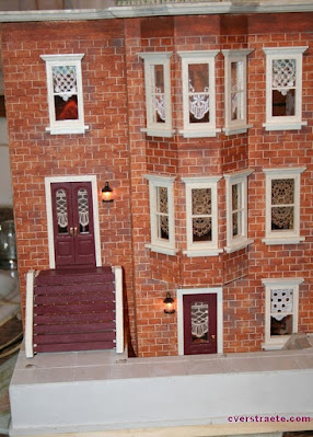
Remember the plain jane - not-quite-finished exterior?
Ah.... it's undergone quite the transformation with all the necessary trimmings in place!
(Be sure to click photos to see full size!! *See last post.)
Keep reading below.... 👇👇👇
I just LOVE 💗 how the extras and the different details I used really add to the design!
I don't like plain or drab, so I'm always thinking up different elements to use. But first....
Something Fun! If you didn't see my
previous toys post, my friend Gigi found a car which looks good with the house! I'll have to fit dogs and lots of boxes in here for moving-in day!
And now... The results so far:
TA-DAH!!!!
The Roof:

I just love it!! 💗This turned out pretty cool. I hadn't even thought of a rooftop garden until Joanne mentioned she was doing one. (Yeah, copycat I am! See her "modern" house on a previous post.) (Ignore all the bare edges as I have to cut and glue trim yet.)
I cut 1" scale stairway railing into pieces for planters to fit around the top edges on the roof. I drilled holes in the center and filled them with a somewhat sparkly fake fern I found at Christmas as I wanted something kind of bushy with some shimmer to it. Can't have the people falling off the roof. ha! I'm thinking of adding a string of tiny white mini lights but I seem to only have multi-color, so will keep searching.
I really like the plants as, to me, it looked too plain without them. And yes, that is a Gargoyle on top to "protect" the building. Maybe later I'll add smaller ones at each corner. (I realize I have lots of skulls in the stash but need more gargoyles!) I glued fake grass on top and put a fake doorway that leads to the "stairs" going down. Yeah, there are lots of "fake," I mean "faux" elements. haa!
The Front:
It takes me sooo long to finish things as I'm never happy with doing a kit or any project as-is. I always have to change things!
One thing always leads to another and another: I used the staircase railing pieces for the front posts since I had to change the portico as I forgot to make room for the light I'd already added. I also added a "metal" sticker design (Dollar Tree) to fill that empty space in the center.
So, the light got moved over a "smidge"(technical term 😆), then new posts were cut which led to adjusting the staircase railings. And I didn't think the larger brick posts looked right at the ends of the railings, so I cut smaller wood posts. Those look much better!
I then had to move the brick post over slightly to the right and cut the fence a tiny bit to fit. Whew! Still with me?
🌷 Now it's pretty much done, except I still have to add some tiny window boxes I made and make flowers 🌸 for them. Not sure whether I'll use them only on the tower windows or in all of them. Will have to see what looks best. What do you think?
👀 And... I keep eyeing those flat bare spots on top of the brick posts, which seem to be calling out for some kind of round planter pots. See what I mean? Will have to hunt in my beads; I know I had some small bowl-type beads... or it'll be back to the craft store. Again. Besides, I like flowers. They're like books (mini and real.) Can't have too many. 😊
Inside:
Third floor doorway:
 |
| I put in a couple "beams" to cover that slot I cut in the ceiling. |
My idea for the faux doors leading to the "hallways" worked out great - after I had to redo some things--of course! haa! Luckily I only covered up one tape run and the paper pulled up so I could pull out the light, move it up, and re-solder it since it didn't quite reach the hole. I moved a second light also. I drilled a hole in the wall and in the small box, which was then covered with a printed transparency. And it worked! (I had to re-solder quite a few times and believe me, I hold my breath every time that it'll work!)
Second floor: Got the rest of the trim done. Just have to glue the fireplace in (right side, below). I want shelves but I may just add one or two across the whole wall as ugh! all the measuring to make them fit, I'm tired of measuring (or with me, measure once, cut three or more times. haa!) We'll see what I end up with. (I might have to adjust the bottom of the door a bit I see.)
I like the ceiling molding which has scribed lines at the bottom that I touched with the gold paint to match the wallpaper (scrapbook paper.) I really liked the shiny gold accents in the paper. I also changed the brick inside the fireplace to match the white brick paper I used on this floor.
First floor:
It's hard to tell here, but the ceiling trim in the diner area has a scalloped edge on the bottom which gives it a fun, "circus" feel to go with the striped paper.
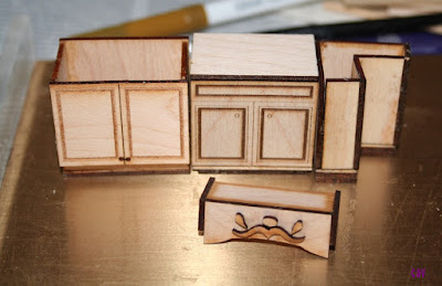
Next: Working on some furnishings and kits, and I need to configure the diner counter, cooking grill, etc. to see what will fit and what goes where. Got another of those ideas in my head - burgers sizzling on the griddle - so it'll be fun to see how I can get that idea to work and look right.
So far, so good! I'm pretty happy with how this is turning out. Stay tuned for more updates!
Thanks for visiting again and following along on my projects! Hope you have lots of mini fun in the new year!


.JPG)


%20Died%20in%20Your%20Arms%5B44%5D.jpg)


